How to choose the right website layout for your brand with getting overwhelmed.
Many small businesses don’t realize all the options they have when building a website. Your layout isn’t just about aesthetics but also how users experience your brand, navigate your content, and act.
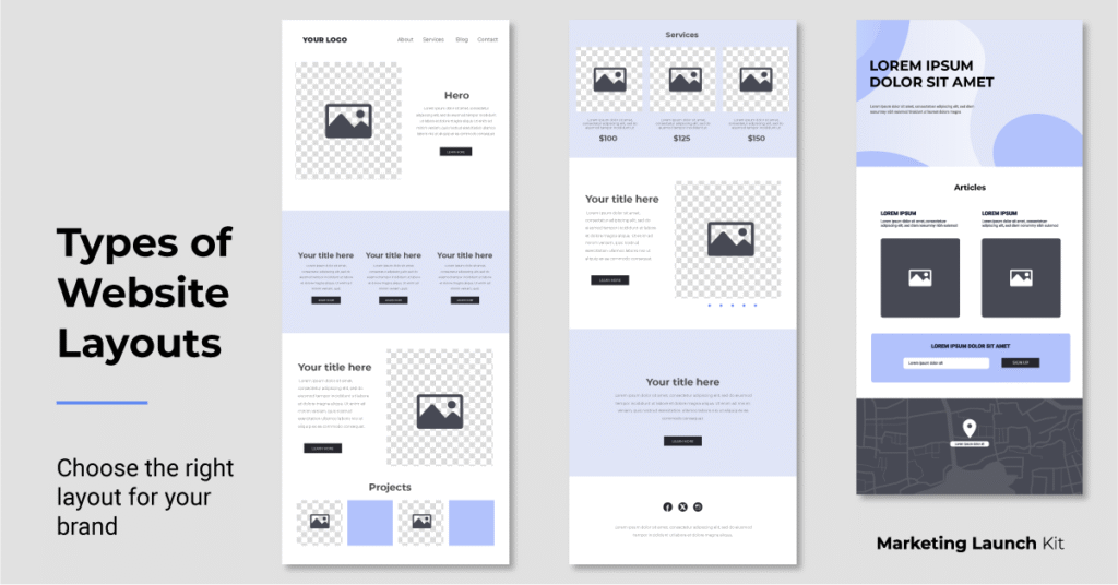
Choosing the right website structure helps you organize your content in a way that feels natural and intentional. Here’s a quick guide about different website layouts, to help you figure out what you want to build.
Website Layout Structures
This is the arrangement of parts on your website.
A website layout structure is the framework showing how content is organized on a page. It determines the placement of key elements like text, images, and navigation, shaping the flow and overall user experience. An intentional layout helps guide visitors through your site in a clear and engaging way.
Website Foundations
1. Single Page Website (One Pager)
A single page website or “one pager” displays all your content on one long, scrollable page. Instead of navigating to multiple pages, users click anchor links that smoothly jump to specific sections (About, Services, Pricing, Contact).
This layout is simple, fast, and mobile friendly, which is perfect for businesses with a straightforward offering that doesn’t require complex navigation.
Best for: personal portfolios, events, and businesses with one main product and/or service offering.
Examples:
- Local service providers (mobile dog grooming, cleaning services, lawn care, handyman)
- Solo practitioners (therapists, consultants, attorneys, bookkeepers, creative freelancers)
- Beauty & personal services (hair stylists, brow artists, nail techs, makeup artists)
2. Multi-Page Website
A multi-page website is your classic website structure with dedicated pages for each section (home, about, services, case studies, etc.). Users navigate through the site via a menu, which allows for a more layered and intentional user experience that is stronger for SEO.
This layout gives more room to organize content and complex information in a way that is easier to understand and supports a layered user journey.
Best for: businesses with multiple services, products, or content types that need to be broken out across separate pages.
Examples:
- B2B companies (OEM suppliers, staffing firms, legal services, engineering consultants, marketing agencies)
- Tech (SaaS platforms, app developers, hardware & IoT solutions)
- Health & wellness (med spas, physical therapists, personal trainers)
- Education & trade associations (universities, post education, community organizations, trade affiliates/chapters
Common Layout Structures
Used in Both Single Page & Multi-Page Sites
Think of “single page vs multi-page” as the outline for your house and the number of rooms you’ll have. Then think of layouts (like f-layout, grid, split-screen, or hero) as how you design each room. You can have a single room with a bold layout, or multiple rooms, each with their own ambiance.
1. F-Layout
The F-layout is based on how people naturally scan a screen: top to bottom, left to right in an “F” shape. It places key content pieces like headlines, navigations, and CTAs intuitively along this visual path.
This layout works effectively for sites that are content heavy, where reading order matters.
Best for: sites with structured content like news outlets, media/PR publications, blogs, or government.
2. Grid Layout
A grid layout organizes websites pieces into a modular structure that resembles cards, tiles, or blocks with even spacing on the page. It’s easy for users to scan multiple options at once on a clean and visual structure.
This layout is great for showcasing multiple pieces of content that require categorization.
Best for: image heavy sites that need balance like photographer portfolios, graphic designers, template shops, or video creators.
3. Split Screen Layout
A split screen layout divides the screen into two sections vertically or horizontally which gives users side by side choices or showing dual content types.
This layout is great for creating visual contrast or highlighting two different user paths with immediate choices.
Best for: Brands with dual focuses or two clear audiences like “product vs service” or content “for employers” vs for “job seekers”.
4. Hero Layout
The hero layout is idea starts with an immersive bold video or image at the top of the page paired with headline and CTA. It’s designed to hook visitors right away and guide them toward your main action. This works well if you want to lead with emotion or story because it grabs attention and drives action.
This layout is ideal for modern brands trying to make a bold visual statement.
Best for: brands driving impact like motivational speakers, lifestyle brands, SaaS startups, or interior designers.
Your website layout isn’t just a design but rather a choice that shapes how people experience your brand. Whether you go with a single page, a full multi-page site, or mix in layout styles like grids or hero sections, the goal is the same: to make your content clear, engaging, and easy to navigate.
The best layout is the one that fits your business goals, your content needs, and your audience’s attention span.
Ready to launch with the right website layout?
If you’re still not sure which direction to go or you’d rather not figure it out alone, that’s exactly what I help with. Marketing Launch Kit offers done-for-you branding and websites, built to match your business, your style, and your goals (without the tech stress or generic templates).
Get a beautiful, strategic website built by a marketing pro with years of real experience many years.